Many believe it to be true that different colors do impact how you feel, your behaviors, moods, and feelings. Color psychology has been around for centuries, but more recently studied due to color psychology becoming a popular topic in marketing, art, design, and many more areas. It is a known fact that ancient cultures such as the Chinese used colors to heal, and colorology remains a form of holistic treatment, proven for centuries to work.
It has been only lately that researchers discovered how much color affects the human mind, creating various moods, behaviors, and feelings from the colors painted on the walls of a retail store, partitions of an office to the clothes we wear. Colors impact our mood, attitudes, and behaviors every day, yet unbeknown to most people.
Each color reacts to humans differently by embracing different actions. Colors can be on the walls of an office to the clothing you wear. Colors prove to have a substantial impact on people. A color can signal action and influence how one feels. Color can change emotions and influence reactions.
There is no other communication tool so powerful as color and what that color emanates. For example, the color yellow tends to express a feeling of anxiousness. If the office you work in has the shade of light blue covering the walls, chances are you are going to feel relaxed and serene versus the walls covered in a bright yellow color that emanates restlessness and anxiousness.
History of Color Psychology
The nature and effects of color have long attracted people’s interest, despite the fact that the science of color psychology is still in its infancy. Colors were often employed in ancient societies to cure various ailments and affect emotions. They contributed to a variety of spiritual practices as well.
Sir Isaac Newton, an English physicist, discovered in 1666 that all colors are discernible when pure white light passes through a prism. Moreover, Newton discovered that each color is made up of a single wavelength and cannot be divided into other hues.
Further tests showed that light could be blended to create different hues. Orange, for instance, is produced when the red and yellow light is combined. When certain hues are combined, such as green and magenta, they cancel each other out and produce white light.
Experts reviewed the previous research on the psychology of color and stated that given the popularity of color, one would anticipate color psychology to be a well-developed field. Interestingly, few theoretical or empirical findings have been done thus far on the impact of color on psychological functioning, and the research that has been done has been primarily motivated by pragmatic considerations rather than rigorous scientific inquiry.
Yet, several significant findings and observations concerning the psychology of color and its impact on emotions, feelings, and actions have been made by academics and specialists. The majority of the data in this developing field is anecdotal at best.
Model of color psychology
The overall model of color psychology is based on the following six fundamental ideas:
- A color’s meaning can be quite particular.
- Either acquired meaning or meaning that is biologically intrinsic underlies color meaning.
- The individual observing automatically evaluates a color upon perception.
- Behavior driven by color is enforced via the assessment process.
- Color often has an automatic effect.
- Context also affects the meaning and impact of color.
How Does Color Influence Decision Making?
It is a proven fact that specific colors impact our well-being and health. Some colors show to increase blood pressure, cause eye strain, and influence mood. However, everyone reacts differently to specific colors, which are the foundation of who we are and our culture. For example, some cultures wear black when there is a death. Other cultures wear white as this represents purity and innocence and symbolizes mourning in different cultures. Colors have different meanings across different cultures.
Colors emanate the powerful effects for different people. For example, some colors say the same thing globally. Some have a feeling of warmth and comfort while these same colors evoke anger, upset, and hostility when they see colors such as those from the red spectrum, yellow, or orange.
Each color has much the same impact on some, while the same colors have a different effect on others.
Researchers find that color is proven to impact people in various and surprising ways and that these effects can be short-term or long-term from specific colors. One extraordinary way is employee work performance. Is that person trying to create a specific image? A lot goes into creating an image such as, but not limited to, gender, age, culture, availability, and price. Researchers study the effects of color preferences that one buys.
Color can significantly affect our decisions, causing a reaction of the eye, nervous system, and the surrounding environment. Color offers different degrees of reflection. After the eye sees the color, the brain processes the color. It takes more of the body’s energy to perceive specific colors such as red, orange, and yellow. These colors stimulate the brain, heart, and respiratory system. Colors like greens and blues seem to calm and relax. Colors make people think and react differently. Researchers found that the vision absorbs only 20 percent of color, and the nervous system absorbs 80 percent.
An office adorned with warm colors such as red, orange, and yellow seems to increase work efficiency. These colors stimulate buyers in the store. On the other hand, colors such as shades of blue and purple seem to slow down office efficiency and relax employees.
Specific colors can increase respiratory rates, make muscles tense, increase heart rate, improve digestion, provokes aggression, increases energy, improve appetite, cause annoyance, gives a sense of freedom, embraces rest, stimulates eyes, bring about a cheerful mood, attract attention, stimulate buyers on what decisions to make, and much more.
How Does Color Psychology Play a Role in Image Consulting?
As an Image Consultant, you teach people how to understand the rules of color. You help others develop a personal image through the styles that are for that person and the colors that embrace a professional, dynamic, and healthy image. There are rules of color to learn, which many are not aware of using. Once you take control of your image, you can get the desired reactions from others that you are looking for. For example,
Image Consultants help with what type of decor a company wants to affect clients better. Just the right spectrum of colors affect the way clients feel about a company and increases buying power, thus increasing profits.
Retail shops can play with a color pallet that enhances customer buying decisions and embrace a comfortable and relaxing atmosphere to shop. Thus customers tend to stay long and shop more because they are within a feel good atmosphere.
Image consultants teach that colors universally affect moods. For example, the warm colors are reds, yellows, and oranges. These colors spur emotions of warmth and comfort or can evoke anger, unkindness, and spite.
While the colors of the red spectrum can have undertones of blue and emit cool colors of calmness such as deep cherry, ruby, burgundy, and ruby, at the same time, these same colors can cast emotions of dignity and seriousness.
Reds can also have an undertone of blue and are known as cool colors such as burgundy, ruby, raspberry, deep cherry. These colors are often described as calm but can also call to mind seriousness and dignity.
Business owners that want to make a positive impression on their customer base hire an image consultant. Those who are in high executive roles may hire the image consultant to advise them on the way to dress using the colors of professionalism thus reaping success within the Company. The image consultant is also available to give decor advice for stores and office settings. Colors when used in the correct manner can increase profits and success for those business owners.
Color Psychology matters in all facets of life, personal and business. Color Psychology helps many people gain successful living.
How Color Psychology Works in Marketing and Advertising
For a variety of reasons, businesses employ color psychology in their marketing and advertising.
- Brand identity – Businesses use color schemes deliberately to match their brand personalities. For a company to effectively convey its viewpoint, the appropriate color palette is important.
- Targeting consumers – Marketers undertake research on how customers interpret various hues. Businesses may focus their marketing efforts on particular demographics by making precise color decisions in accordance with the color preferences of their target audience.
- Conversion rates – Conversion rates calculate the proportion of clients who complete an assignment given by a business. A call to action (CTA) button click or email newsletter signup might be the task.
Applying Color Psychology to Everyday Life
Color is frequently connected to a person’s feelings in art therapy. Also, color may affect how someone feels physically or mentally. For instance, research has revealed that for some people, gazing at the color red elevated their pulse rates, which subsequently caused their bodies to release more adrenaline into their bloodstream.
In relation to the two basic groups of warm and cool colors, there are also often observed psychological impacts of color. Warm hues, including red, yellow, and orange, may arouse a range of feelings, from coziness and warmth to antagonism and wrath. Cool hues like green, blue, and purple can evoke sentiments of serenity and melancholy.
Color psychology ideas may be used in daily life as well. For instance, perhaps you intend to repaint your walls or redecorate your home or room using a new color scheme. You might wish to think about some of these ideas on colors and how they could impact your mood and feelings:
Cool Colors
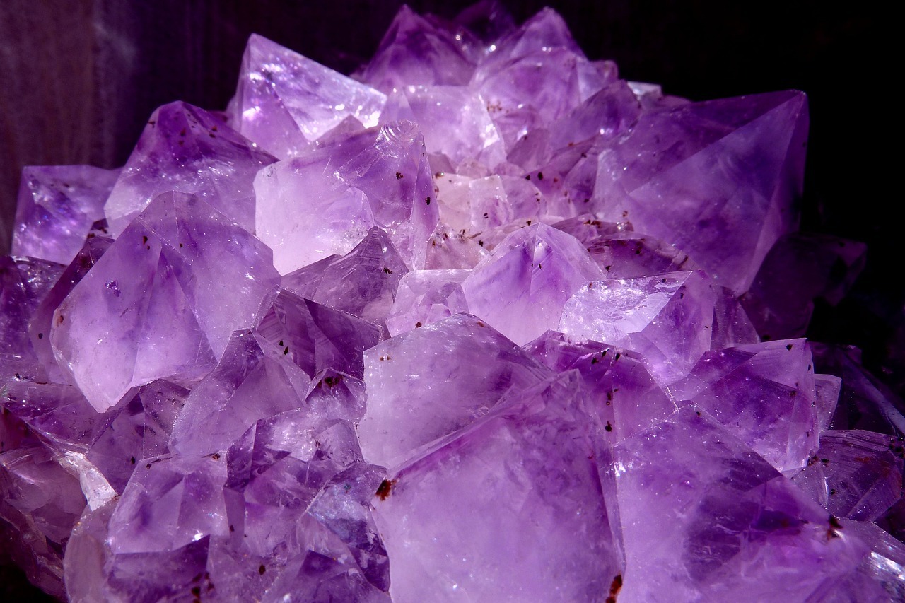
Have to be imaginative? Want assistance activating those brain synapses? Use purple if you can. Purple makes use of both red and blue to create a pleasing harmony between stimulus and tranquility that is meant to foster creativity. Light purple creates a calm environment that eases anxiety. They may make beautiful colors for a house or workplace.
Are you trying to find a quiet and serene setting? You may think about utilizing blue or green. Often, people associate these cold hues with relaxation. Green is thought to be less taxing on your eye muscles because the eye concentrates it directly on the retina.
For high-traffic areas or areas where you or other people will spend a lot of time, the color blue is advised. Blue is another cold hue that is often relaxing and quiet and is supposed to reduce blood pressure and slow breathing. These hues work well in the bedroom since they should promote relaxation.
Warm Colors
Do you want to stimulate people’s minds or pique their appetites? Yellow or orange are two hues you could choose to use. These hues are frequently connected to food and may make you feel a little hungry. Have you ever questioned why such a large number of establishments employ these hues? You can get why some people claimed to be hungry despite having seen the movie SuperSize Me.
You should use caution when utilizing vibrant hues, particularly orange and yellow. They reflect more light and overly excite the eyes, which might irritate someone’s eyes. If you are watching your calories, you probably do not want to paint your dining room or kitchen these hues.
Common Examples of Color Psychology
- Red – Viewers’ pulse rates and blood pressure can be raised by the color red. Passion and vigor are the two qualities this primary hue represents. Red is occasionally used by businesses to convey a feeling of urgency.
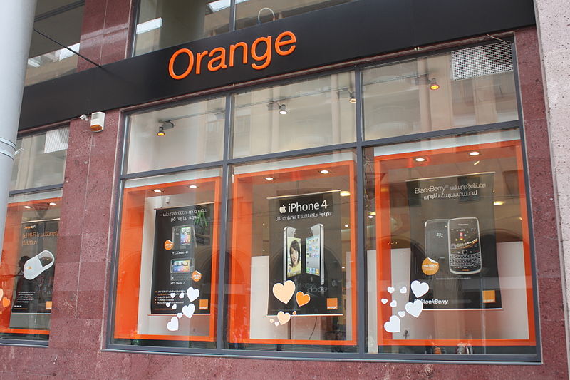
- Orange – The color orange has a fun connotation. Orange, along with other warm hues like yellow, may convey elation and other potently uplifting feelings.
- Blue – Various blue tints or tones have various connections with other colors. Dark blue often denotes strength, reliability, and dependability whereas light blue is typically connected with calm and compassion.
- Green – Green is a secondary hue that is linked to nature and growth. Together with other cold hues like purple, green provides a relaxing effect.
- Indigo – The color of intuition is indigo. Colors have several connotations, including idealism, organization, ritualism, and addiction.
- Turquoise – The significance of the color turquoise is clarity of thought and communication. It may also be utopian and unrealistic.
- Pink – Pink is associated with unrestricted affection and caring in color psychology. Pink may also be girlish, frivolous, and childish.
- Brown – Brown is a warm yet somber, earthy color that is associated with safety, protection, comfort, and financial abundance.
- Gray – Gray is the color of compromise from the standpoint of color psychology because it lies between the non-colors of black and white. It can be indecisive, distant, and emotionless.
- Gold – Gold is the color of triumph, accomplishment, and achievement. The color psychology of gold suggests opulence, material wealth, and extravagance since it is linked to plenty and prosperity, luxury and quality, prestige and refinement, value, and elegance.